


Picture this — you are the new head of your association’s event planning committee and there is one event left on the calendar: your annual conference. It’s the biggest event of the year, but you’re not certain if you can top last year’s turnout.
After all, there are a lot of aspects to manage, including recruiting speakers, finalizing the session schedule, and choosing a caterer. But there’s one aspect that trumps them all — registration. If your association members can’t find their way around your online registration page, you won’t be able to maximize attendance.
Fortunately, there are a few registration page tips you can store in your back pocket:
- Post relevant event content
- Create clear user pathways
- Design your registration form for mobile
- Test for accessibility
While creating and editing your registration page and form, consistently reference what your visitors want, need, and expect from your online presence. If you’re uncertain about specific technical or design elements, ask yourself if the element would improve your visitor’s overall experience. That said, let’s explore some registration page optimization tips!
Post relevant event content
Keep your end user in mind when creating your registration page. In other words, avoid burying your must-know information under organizational facts or unrelated content. Instead, make your event content easily accessible, so visitors can find what they need when they need it.
Here are a few must-have items to include:
- Agenda: Let visitors know when and where the event(s) will take place so they can plan accordingly. If your event is virtual, like a panel, consider adding a countdown clock to increase anticipation.
- Registration form: Post a short form for attendees to register. Include the necessary fields like contact information, account information, and dietary requirements if applicable. Keep this form brief and accessible (more on this below).
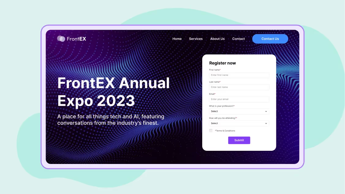
- Pricing information: Be upfront about how much your event will cost. Mention the registration fee, cancellation policy, ticket options, and discounts.
- Short description: Provide your visitors with a couple of sentences to describe your event. Just make sure your description explains the event’s purpose and who should attend so visitors have enough context to understand.
- Images: Include professionally polished photos of your organization members or leaders to catch the eyes of potential attendees. You could also use candid photos from previous events to highlight memories you’ve shared with your community.
- Video: Post short, shareable videos from previous events to build hype so visitors can visualize the event experience. Or, post bite-sized, enthusiastic informational videos explaining the event’s value.
- Social proof: Use social proof as a marketing tool for your event. Compile responses from the previous year’s attendees and (with their permission) post ones that will inspire potential attendees to make the jump and register.
- Share link: Make your registration page shareable, so that current attendees can reach and invite their network to join them.
Creating share links also increases your reach as potential attendees may not know about your event, but their friends or colleagues could nudge them to register. Therefore, add both a share link to your registration page and include a description and link to your registration page on social media platforms such as Facebook and LinkedIn.
Create clear user pathways
Now that users know the gist of your event, double-check that they can perform the necessary steps to register. Make it easy on them by creating simple user pathways that seamlessly take them from A to B, or from your informational page to the registration form.
Follow these best practices to ensure that your interested website visitors become registered attendees:
- Add color contrast. Light gray menus or text against a white background can cause visitors to strain their eyes, misunderstand, or abandon a registration page altogether. Keep your details legible with optimized color contrast.
- Minimize drop-down menus. Instead of drop-downs, opt for clear and specific CTAs to lead visitors to a dedicated registration form.
- Use well-placed CTAs and buttons. Call-to-actions (CTAs) anticipate visitors’ needs and provide an accessible way for them to complete the next desired step with descriptors like “register today” or “secure your spot.”
- Use a sequential heading structure. Sequential heading structures create a clear visual hierarchy. For example, your H1 title could be “Join Us for Mental Health America’s Spring Conference” with H2 titles beneath detailing the conference schedule and keynote speaker profiles.
Once you’ve thought through each of these design and informational components, double-check for consistency across your registration page and form. Match your page’s look and feel to the rest of your website and your registration form. That way, visitors don’t feel misled when signing up.
Design your registration form for mobile
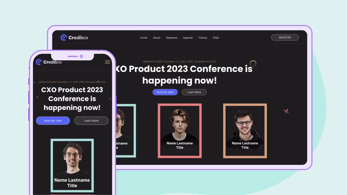
Did you know that 90% of users access the internet with their mobile devices? So, even if you’re creating your registration page on a desktop, you’ll need to optimize your registration form for mobile to prevent potential attendees from excessive scrolling, pinching and zooming, or even page abandonment.
Now that your visitors have made it to the registration form, keep them engaged with these mobile-friendly best practices:
- Eliminate unnecessary fields to decrease scrolling. Simplify your forms so that they take as little time as possible and are not distracted from completing them.
- If your form is long, include a progress bar to indicate the next steps. If your form requires visitors to set up a login, for example, show it's only one of three total steps.
- Validate errors and mark mandatory fields to remind visitors not to skip any. This way, visitors don't have to scroll back through and edit previous fields once they’re finished.
- Autofill inputs when possible to save visitors time. Autocorrect and autofill pop-up features improve the user experience by keeping it straightforward and quick.
- Use a single-column layout when creating a multi-step form. Double-column layouts can be daunting and misleading for mobile visitors with a narrow screen, so keep your information streamlined in a single column instead.
- Keep your payment processing straightforward. As the last step in the registration process, recommend visitors use scanning apps to simply scan a secure photo of the front and back of their card and decrease the need for manual user input.
In comparison to a desktop user’s average range of 13 to 24 inches, mobile screens are 4.7 to 6.7 inches. That said, keep track of how many touchpoints you’re asking your visitors to input, and minimize them where possible.
Test for accessibility
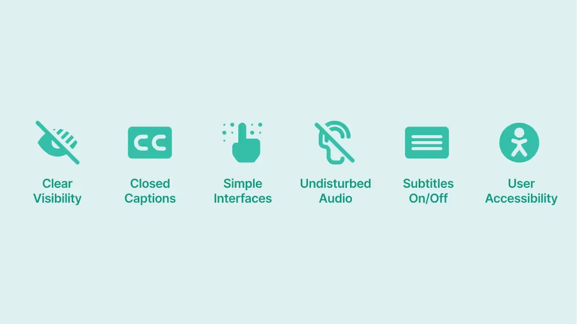
What’s the best way to ensure your form’s usability? By testing it and making needed adjustments. An accessible form is not only optimized for general user experience but also is inclusive of everyone. Here's a guide to making inclusive and accessible forms:
- Optimizing desktop keyboard navigation. Be sure all forms are accessible via keyboard in case visitors are using a broken trackpad or assistive technology.
- Avoiding time limits. If your form is longer, stay away from including time limits as these can be overwhelming for some visitors.
- Including video transcripts for any relevant media. If your registration page has a video or audio component, make sure visitors with hearing impairments can access it.
Recruit volunteers to test out your registration form and page and gather actionable feedback to make necessary changes. Attempt to recruit a large and diverse sample of participants to gather as much feedback as needed to be confident in your page’s accessibility and overall user experience.
By keeping your registration information brief and relevant, visitors can easily sign up for your event and eagerly await its arrival. Creating clear user pathways, optimizing for mobile, and testing for accessibility will ensure you solve problems before they arise while prioritizing your visitors’ user experience.
Subscribe to our blog now!


.avif)


